

Since the release of the first iPhone in 2007, and the first Android phone following shortly after in 2008, smartphones became deeply enmeshed in all cultures of the world. And, as the devices have grown in popularity, technology packed into the limited physical space of smart devices has evolved dramatically. While the smartphone’s core mechanics have remained the same over the years, manufacturers have tried to bring their own changes to shape the consumer view of what features a modern-day smartphone should have, such as wireless charging, a notch, and the controversial removal of the headphone jack.
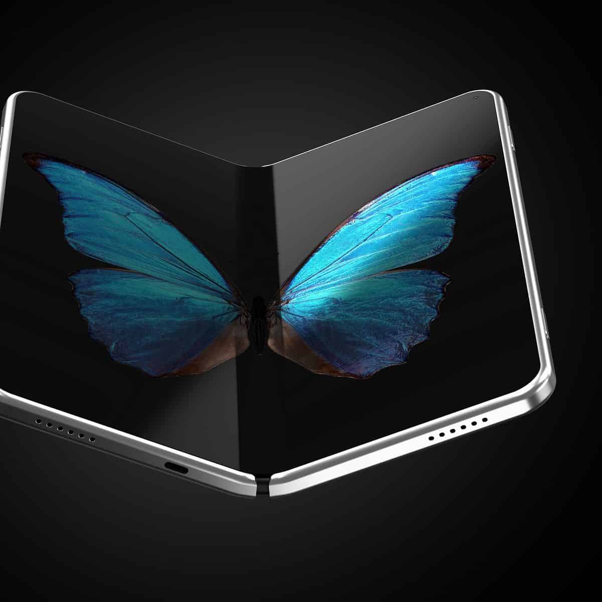
The usual pattern of technology advancement is for the hardware to become smaller and more powerful. Still, smartphones have been going the opposite way, and the trend of recent years has been to make phones larger, as more users begin to prefer larger phones and “phablets.” This has raised the issue of carrying these large devices comfortably, leading to the attempted development of foldable-screen phones. At the time of this writing, there are six commercially available foldable phones, and they fold in different ways, which presents different considerations for developers.
TRANSITIONING YOUR APP TO THE NEW SCREEN
Android developers have been building layouts in XML for years. This new folding screen phenomenon may look new and daunting. Still, in practice, the act of folding or unfolding a phone screen can be described as a transition effect, and that is something all Android developers have experience with.
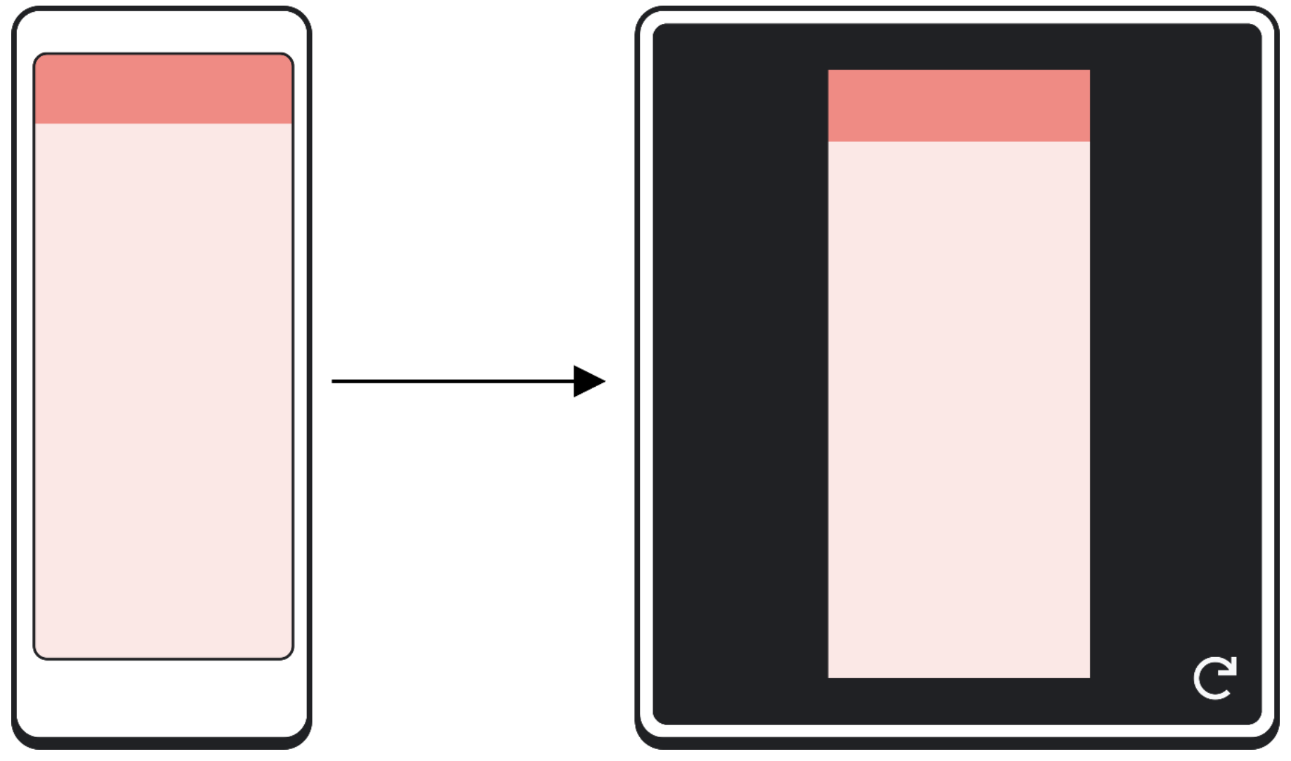
The regular smartphone has two orientations; portrait and landscape. The act of orienting your phone from one state to another is a transition. We now must consider transitioning not just portrait to landscape but unfolded to folded, and after this transition takes place, the app should resume in the same state and location it was when the orientation was changed. Saving the UI state and making use of View Models will preserve data and screen information during this transition.
To make your app ‘resizable’ (Google’s terminology), in the manifest file, you add the property ‘resizableActivity=true’ to your activity. If you set this property to “false,” the app will not be resizable. And, when your users run the app on the unfolded (full-size screen), the app will still run, albeit with a border to maintain the aspect ratio you have set. This is called compatibility mode.
Adding this property will also prevent multi-window, blocking a user from having your app on screen and sharing half the space with another app. Since one of the appealing features of larger screen space is more convenient multi-tasking with apps, this is unlikely to be a recommended practice. In order to better support multi-window use cases, add this to the meta-data of your app manifest:
<meta-data
android:name=“android.allow_multiple_resumed_activities” android:value=“true” />
This will enable your app to enter resume state when in window mode after an event might put it into pause state, such as the notification window being opened to cover all windowed apps. This is supported on Android 10 and select Android 9 devices and will be a mandatory requirement in future Android versions.
In terms of the new screen ratios, the documentation suggests you should support a wide range of aspect ratios, as foldable’s can come in many sizes and expand to be square or rectangular. The recommended ratios you should support and, if possible, test for are:
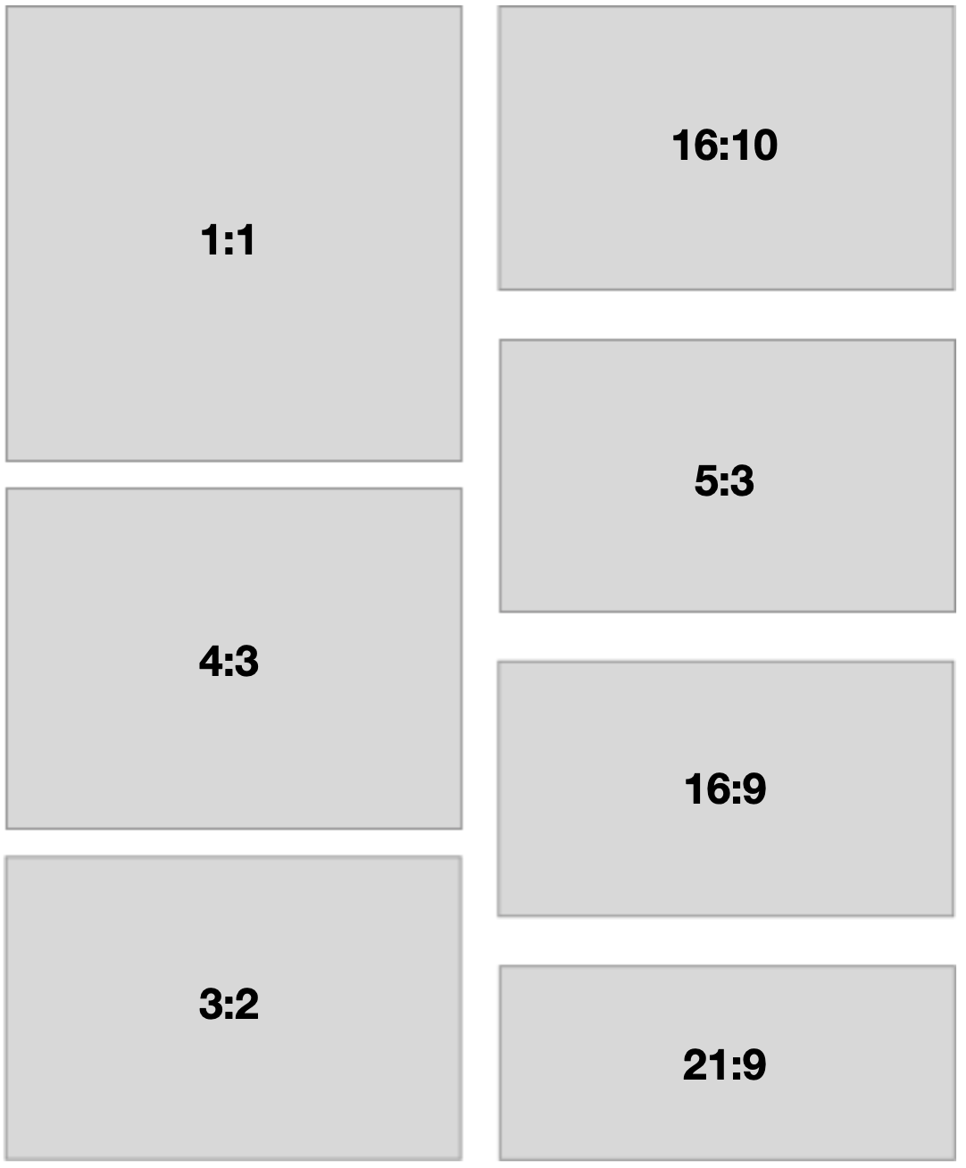
As you can see, that is quite a lot of anticipated screen ratios. In terms of how to best fit your apps to the different screen sizes, ratios, and, orientations, continued widespread use of the ConstraintLayout is advised. An abstention from hardcoded values in the height and width fields of your XML layouts (of course, you were already doing that).
In terms of developing specifically for a fully expanded screen that could be double the size of a standard phone, what we have is effectively a very tall landscape screen (unless we’re dealing with the 1:1 ratio and have a square screen). So our landscape approach of making an XML layout specifically for landscape orientation should still be appropriate for these new, huge screens.
Developers who have worked on tablet-specific apps will have some advantage here in terms of sizing UI elements, so they are not comically large or infuriatingly small on the larger screen. Unfortunately, the blog can’t go any further in exploring case studies or documentation on expanded phone screen design. Because it is so new, we are still waiting to see if this is the next step in the smartphone evolution or just a fad that will be forgotten about in a couple of years.
This all pretty much boils down to the fact that if Apple goes in the direction of foldable tech, then we’re stuck with it.
Ready to choose a software outsourcing company with mobile development expertise?
Unosquare is ready to help. We focus on finding the best talent in the world and putting together a delivery management practice that is your eyes and ears within our organization. Let us provide the complementing expertise for your teams in a fast, transparent, and efficient way with our distributed agile software development staffing solutions. To find out more about outsourcing software projects with Unosquare and read additional technical articles, check out our blog.
